This product is very interesting to look at. The illustrations are very eye catching and detailed. There is no real structure to what they are and what they represent but they work because its creating a very visually pleasing and engaging product. The vibrant colours compliment the illustrations and it really makes the product stand out.
My only problem with the product, and i think its a key one, is i don't actually know what the product is. It has something to do with cream and 25oz but its not obvious. I think they spent too much time on the illustrations and not enough on branding the product successfully, which is something i am really going to have to keep in mind.
WillBe
Italy
Packaging Design for Victor Philippe, italian brand manufacturer of cosmetic products from natural sources. We have designed different packages of product lines, declining structure and color.
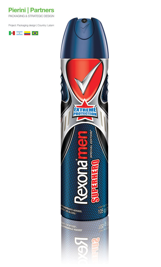
The new Rexona Men packaging, designed by Pierini, has super-powers
Pierini Partners, the leader agency of strategic packaging in Argentina, designed for the brand Rexona Men, the packaging for its new variety SUPERHERO.
Inspired in the aesthetics of 1940s comics, and thought as a product able to accompany the heroes looking for justice in their most difficult situations, the new layout reinforces our imagination, making us experience the adventures our idols lived.
The chromatic palette is based on silver, red and blue, classic colours in superheroes (Superman, Spiderman, and Captain America, among others), which are combined with iconographic elements such as the star, or the metallic shield.
Adrian Pierini, the agency’s CEO referred to this project: “Since I was a little boy, I always felt a special attraction to the fantasy these superheroes provoke. I was interest by the fight between good and evil, the ability of helping without receiving any in exchange, and by how they became an example of integrity and courage.
Working in this project meant a return to my childhood and all the good things it implies. The new variety is, for us designers and for consumers, a magnificent opportunity, given by the leader antiperspirant company, to feel superheroes able to cope with all the challenges the world face us with daily”.
BrandOpus blends new masterbrand mark for Schwartz
McCormick UK Ltd, the UK subsidiary of McCormick & company, Inc., a global leader in flavour, have unveiled the first products of their Schwartz consumer brand redesign by strategic design agency BrandOpus. The project sees the company take a masterbrand approach, with the introduction of a single brand mark, applied to all brand communications and across the entire Schwartz packaging range.
As part of its strategy to strengthen the brand McCormick UK Ltd appointed BrandOpus to help reinforce their reputation as category expert providing superior quality and innovative products. In response the agency introduced a masterbrand approach, creating distinctive brand equities that allow McCormick to frame information in a unified way across all brand communications and product packaging, showcasing the depth and breadth of the Schwartz brand portfolio.
The brand identity itself is a blend of overlapping ellipses designed to represent the idea of blending flavours. On pack, the identity extends to form a holding device that changes to reflect the personality and product differentiation between and within ranges; but always holds the name and concise information about the product to allow consumers to choose the correct product quickly and easily from the fixture. Notably, the product imagery on pack has moved from the table to the kitchen, capturing the ‘cooking moment’ and cementing the brand role as partners in creating delicious dishes everyday.
Key to the brief was to simplify navigation and increase cross-purchasing across the wide and varied portfolio of herbs, spices, seasonings and recipe mixes. BrandOpus created a clear brand architecture and simplified the ranging strategy to encourage shoppers to explore the wider product range. Following the review the portfolio can evolve to include new recipes and products in a logical way.
The redesign has given McCormick the opportunity to continue to strengthen their brand by harmonising presentation of their consumer range and ensuring alignment on how the brand equities are applied.
The first redesigned products in the Schwartz range are rolling out into stores now.
"A new take-home range for frozen yogurt brand yoomoo has launched in partnership with R&R Ice Cream, with packaging designed by leading London brand design agency Bulletproof.
Following Bulletproof’s successful creation of the yoomoo brand identity in 2010, the agency was awarded the project as part of its on-going relationship with the brand.
Commenting on the project Joanna Buist, Account Manager, said: 'The yoomoo brand has established its roots over the last two years and is now one of the leading frozen yogurt brands in the UK. The recent boom in frozen yogurt retailers has opened the category up to a wider audience creating a huge opportunity for the brand in take-home as well.'
Nina Fortune, Design Director, adds: 'The yoomoo brand is all about personality. Our challenge was to ensure that this brand personality was retained in the take-home range whilst creating standout in the freezer cabinet and communicating yoomoo’s low fat, healthier offering.'
The new yoomoo take-home range has been available since April 2012, in a range of 150ml mini pots and 750ml sharing tubs, across retailers nationwide."
Designed by Dragon Rouge, France.
Tags: Bath and Beauty, Europe, France, Source: packagingoftheworld.com
IXXI: Anti-aging from the pine trees of Landes
SEVEATHERAPY
At Dax, this major proprietor in the Landes forest region owns a research centre which has discovered the benefits of the active ingredient derived from the bark of Landes forest pine trees. Its powerful antioxidant and anti-free radical properties - both natural and bio-available - have lead to the patent “OPC PIN”. From this was developed the concept of Seveatherapy: natural anti-aging at the service of women’s beauty and enjoyment, brought to life by the Ixxi brand. Ixxi’s identity evokes nature and science within a sensory spirit. This global concept was designed by Dragon Rouge.
A BRAND ARCHITECTURE WHICH STRENGTHENS POSITIONING
Expert and proprietary semantics, combined with high status, high impact packaging - give credibility to the Ixxi brand in its main distribution channel of pharmacies in France and around the world. A compact product offer has been created for the launch, with 3 cosmetic lines corresponding to the 3 stages of skin aging:
- the soft-green coloured Inixial range prevents first wrinkles;
- the plum-pearl coloured Elixir segment combats expression lines;
- the brushed-gold coloured Sublixime line treats deep wrinkles.
THE EXPRESSION OF A NEW STATE OF MIND
The launch of Ixxi is assisted by its three-point brand style: a deep green colour, breaking from the norm in its segment, evoking high-performance and the product’s origins, a key visual element expressing quintessence and protection, systematically associated with the product image, a direct style of wording which communicates the product benefits. Association of these three elements varies depending on the media, for example web communications, launch posters, POS, etc.
The PND Futura agency conducted a rebranding of Jupik - a brand of children's drinks which belongs to the portfolio Hoop Polska. The project resulted from the need to refresh the brand and adjust it to the needs of a slightly older target group (10-12 years old). Key elements which make up the Jupik image have been profoundly transformed: the adventures have more action, the previous cartoon-style graphics have been replaced by comics with hyper-realistic portraits of members of the JUPIK TEAM. The heroes (5 characters each with their own flavor) have individual characteristics and personal histories, and are equipped with attractive gadgets on the frontier of current hi-tech and science fiction.From now on the JUPIK TEAM members are Team of Elite Agents of Mystery battling with the equally secret and mysterious organization MIST. The brand's new world is reflected on packages recently appearing in stores.
Designed by Blend-it Design, Israel. Source: packagingoftheworld.com
Branding and design for a company specializing in the field of baking. The design concept was based on the scientific precision and perfectionism required of the pastry chef, in contrast to the sensuality and spontaneity expressed by the "messy" dirty dishes and work area.
Designed by Marisol Escorza at the Master’s Degree in Packaging Design – Elisava, School of Design and Engineering in Barcelona, Spain.
The Wonder bread present in the American families wants to become known in the European market. For that reason, the packaging was redesigned to communicate, to the new consumers, the characteristic concepts of the brand.
The new proposal uses graphic codes as the seal to show the tradition concept of the brand (since 1921). Around the pack a brown band with a small pattern, which recalls the bakery bags, giving the familiar aspect to the product. The transparency area shows different types of bread, with a specific colour and their evident quality as well. The logotype is kept in the Mexican version.
Designed by Shanti Shiue, student at the Art Center College of Design, United States. Source: packagingoftheworld.com
Bloom, the cosmetic collection of L’Occitane, is to celebrate the beauty of nature through the form of their products and through the use of natural ingredients; inspired by nature, the packaging of Bloom contains an element of surprise.
L’Occitane has the great opportunity of having a standard line of quality cosmetic products, as well as luxury collections made of natural ingredients. The original inspiration of Bloom are natural elements and vintage figures, which emphasis the sexuality form of women. On the other hand, the vintage inspirations associate more with its mother brand, L’Occitane. In order to reinforce the idea of using natural ingredients in the cosmetic products, the shape of the caps were featured by flower petal. Like most of the L’Occitane products, the exteriors of Bloom were simply designed and with simple functions; however, a flower blooms when the package is unwrapped. For color choices of Bloom, brown represents soil, pink for flower and white for its purity.
The folding of the box is economical, therefore, reduces waste and cost. The flower inspired folding protects products firmly by locking the bottle within the structure when its shipped. There is no second layer of protection needed, and the template of box made out by one sheet of paper which is also cost effective. Box of Bloom made by a soft touched paper represents the softness of petal. The box is locked by a simple hook, when it's opened, the structure spreads out like the blooming of the flower. Finally, audience sees the image of the whole flower, which reminds people the original design concept behinds Bloom.
Bloom is not only a cosmetic collection, but is to bring a whole new experience of shopping cosmetic products. It is to celebrate the beauty of nature.
Designed by Mara Rodriguez, a student of the Master's Degree in Packaging Design at ELISAVA school in Barcelona, Spain. Source: packagingoftheworld.com
This is a proposal for a new Underwear collection that will "help" you to survive a hard day. New colorful clothes for men and women. Four different models contained in a single box.
Each one represent a common problem of our daily life, and if you use them, you'll feel yourself more confident to pass it by.
Designed by Hybrid Design, United States. Source: packagingoftheworld.com
As the brand increased exposure and popularity, FRS wanted to bring new audiences into the brand who were looking for a healthy performance beverage with great taste.
Hybrid Design, San Francisco, amplified the flavor appeal by redesigning their core packaging to feel less like a supplement and more like a flavorful beverage. “We considered their top selling flavors as well as new additions to the line, and looked to visually represent the fruit juices in each flavor through the use of delicious imagery and bright colors” said Dora Drimalas, partner, Hybrid Design.
Six single serve 11.5 cans now feature bold fruit graphics and a color palette which evoke their natural fruit flavors and refreshing taste.


.jpg)
.jpg)
.jpg)
.jpg)


