Pages

Related Tags

Showing posts with label Americas. Show all posts

Monday, May 28, 2012

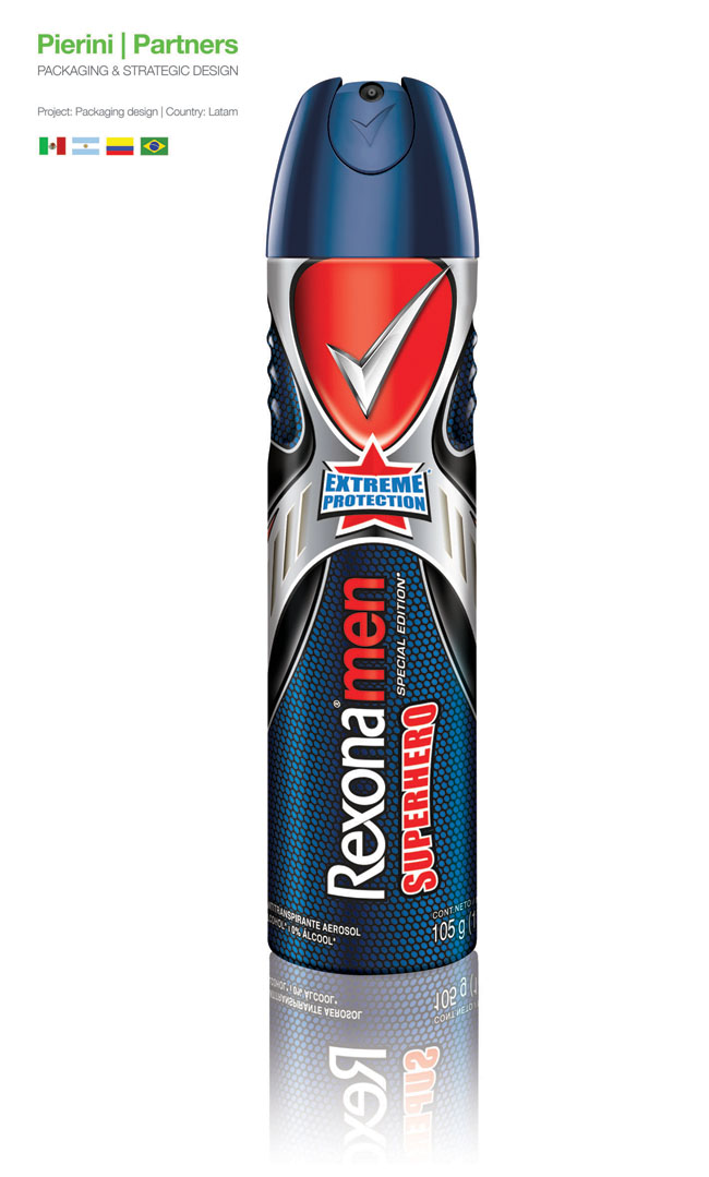
Rexona Men Superhero


The new Rexona Men packaging, designed by Pierini, has super-powers

Pierini Partners, the leader agency of strategic packaging in Argentina, designed for the brand Rexona Men, the packaging for its new variety SUPERHERO.

Inspired in the aesthetics of 1940s comics, and thought as a product able to accompany the heroes looking for justice in their most difficult situations, the new layout reinforces our imagination, making us experience the adventures our idols lived.

The chromatic palette is based on silver, red and blue, classic colours in superheroes (Superman, Spiderman, and Captain America, among others), which are combined with iconographic elements such as the star, or the metallic shield.

Adrian Pierini, the agency’s CEO referred to this project: “Since I was a little boy, I always felt a special attraction to the fantasy these superheroes provoke. I was interest by the fight between good and evil, the ability of helping without receiving any in exchange, and by how they became an example of integrity and courage.

Working in this project meant a return to my childhood and all the good things it implies. The new variety is, for us designers and for consumers, a magnificent opportunity, given by the leader antiperspirant company, to feel superheroes able to cope with all the challenges the world face us with daily”.




Sunday, March 18, 2012

Bloom En Provence (Student Work)

 Designed by Shanti Shiue, student at the Art Center College of Design, United States. Source: packagingoftheworld.com

Bloom, the cosmetic collection of L’Occitane, is to celebrate the beauty of nature through the form of their products and through the use of natural ingredients; inspired by nature, the packaging of Bloom contains an element of surprise.

L’Occitane has the great opportunity of having a standard line of quality cosmetic products, as well as luxury collections made of natural ingredients. The original inspiration of Bloom are natural elements and vintage figures, which emphasis the sexuality form of women. On the other hand, the vintage inspirations associate more with its mother brand, L’Occitane. In order to reinforce the idea of using natural ingredients in the cosmetic products, the shape of the caps were featured by flower petal. Like most of the L’Occitane products, the exteriors of Bloom were simply designed and with simple functions; however, a flower blooms when the package is unwrapped. For color choices of Bloom, brown represents soil, pink for flower and white for its purity.
 The folding of the box is economical, therefore, reduces waste and cost. The flower inspired folding protects products firmly by locking the bottle within the structure when its shipped. There is no second layer of protection needed, and the template of box made out by one sheet of paper which is also cost effective. Box of Bloom made by a soft touched paper represents the softness of petal. The box is locked by a simple hook, when it's opened, the structure spreads out like the blooming of the flower. Finally, audience sees the image of the whole flower, which reminds people the original design concept behinds Bloom.
 Bloom is not only a cosmetic collection, but is to bring a whole new experience of shopping cosmetic products. It is to celebrate the beauty of nature.

FRS Fruit Juice


Designed by Hybrid Design, United States. Source: packagingoftheworld.com

As the brand increased exposure and popularity, FRS wanted to bring new audiences into the brand who were looking for a healthy performance beverage with great taste.

Hybrid Design, San Francisco, amplified the flavor appeal by redesigning their core packaging to feel less like a supplement and more like a flavorful beverage. “We considered their top selling flavors as well as new additions to the line, and looked to visually represent the fruit juices in each flavor through the use of delicious imagery and bright colors” said Dora Drimalas, partner, Hybrid Design.

Six single serve 11.5 cans now feature bold fruit graphics and a color palette which evoke their natural fruit flavors and refreshing taste.

Tikies Chopstick Sets (Student Work)

 Designed by Hung Liu. 2011 BFA Emphasis in Graphic Design, Fort Hays State University, United States.

Tikies is a chopstick set consist of 6 pairs of chopsticks and 6 chopstick rests.

By peeling off the package itself Tikies reuse parts of itself to fold up chopsticks rests. The concept is based out of reusing packaging itself and do not have to worry where to set your chopsticks.


Wednesday, February 29, 2012

Note (Student Work)


Designed by Corrine Pant, Canada.
Source: http://packaginguqam.blogspot.com

If there is one thing I hate in packaging is this horrible, even outrageous, manic of packing everything in plastic clam shells. Choosing plastic wrap for non-perishable is often a choice that is unjustifiable for the real needs of the product. To address this problem, Corinne Pant looked at the real needs of electronic parts packaging. In a poetic and very functional gesture, it shows us once again that "less is more".

Power Plant (Student Work)


Designed by Terrence Fradet, a senior studying for my Graphic Design BFA and a minor in Printmaking at Savannah College of Art and Design.
Source: http://www.packagingoftheworld.com

The "Power Plant" is a product that allows the consumer to purchase a light bulb and to plant a seed as well. The contents include the light bulb, a small pot, expandable growing medium and a seed. Light bulbs use a lot of energy, I wanted to draw attention to the florescent bulb in a new way. My intention was to focus on the act of buying something and then the response the consumer has to their consumption. The response in this case is that the light bulb is removed, the seed is placed on the growing medium and water is added, yet there are deeper meanings to this action. My vision for the production of this packaging is a matte two color screen print on white metallic paper

Canteen Tequilla Alcohol


Designed by Kaleidoscope, United States.
Source: http://www.packagingoftheworld.com

The Sauza, 1800 and El Jimador tequila brands have captured double-digit share growth while the category leader Jose Cuervo is in decline. The brands in the tequila market position themselves as being authentic and utilize old-fashioned, ethnic-based package cues. Since the category is really just stealing share from each other versus bringing in new users or switchers from other liquor categories, Kaleidoscope seizes the opportunity to redefine tequila through strategy and design. We transcend cliché visual elements and leverage luxury with inspiration from nightclub-culture denizens to create a disruptive, retro-cool package design with a uniquely urban attitude and swagger. The co-mingling of metal and glass, unconventional shape, love-to-feel-it closure delivers a wholly new experience to enjoy and be seen with. Embracing urban luxury, without the haughty attitude adopted by its competitors, Canteen achieved its mandate - giving high-end urban bars and nightclubs a delicious new alternative.
Related Posts Plugin for WordPress, Blogger...