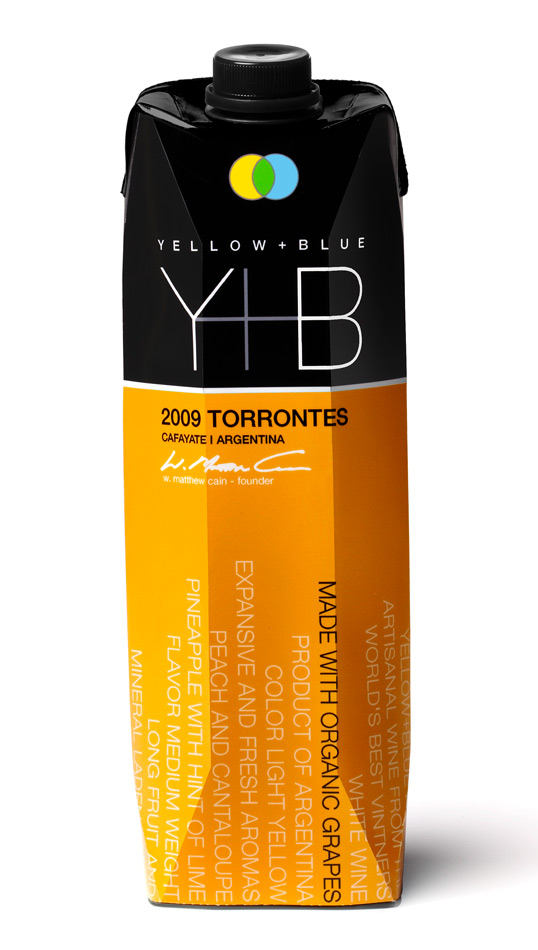
Designed by Spear Design Group | Country: United States
Source: http://lovelypackage.com
“Yellow+Blue = Green, as in organic wines in recyclable Tetra Paks.
Spear Design Group developed the new packaging that tells the Yellow+Blue story for the company’s four eco-friendly, organic wines: Malbec, Torrontes, Sauvignon Blanc and Rosé.
Wine descriptors and factoids wrap around the eco-friendly carton: Artisanal wine from the world’s best vintners, made with organic grapes, 93% wine 7% packaging, smaller carbon footprint costs less to ship, contains 33% more wine than a 750ml glass bottle.
The type grows up vertically to create visual impact. Signed by the Founder & President of the company, W. Matthew Cain.”
Designed by StudioIN, Russia, Source: http://www.packagingoftheworld.com
Milk is a universal and indispensable product.
Going along with the modern tendency to popularize healthy lifestyles and recognizing the importance of environmental protection, we suggest that this product, serving all peoples well since times immemorial, should be super-popularly served in aluminum cans. Their advantages include light weight and strength, aesthetical appearance and compactness. Aluminum cans fully preserve the natural taste and quality of the product and are easily opened. Because of the new design of the packaging, milk may not be just served at home but also taken along anywhere.
Within the same concept, we also suggest a possible extension of the technology of the production of the Tetra Pak packaging. Our idea is using Congreve stamping in the production of regular milk cartons.
The design of the whole line is built on the contrast between the color of the logo with the predominant white, which, as we see it, goes just fine with the product. The soft pastel colors are either lighter or darker depending on fat content and may differ according to varying tastes. The appearance of the packaging will make this traditional product go well with the modern times and make a room for it among the popular beverages of the latest generations.
Because milk is so good for everyone and because of the radically new packaging, Goodmilk may now be called a super-drink.
Japanese industrial designer Naoto Fukasawa has created a series of creative fruit juice packages that have the look and feel of the fruit they contain.
“I imagined that if the surface of the package imitated the colour and texture of the fruit skin, then the object would reproduce the feeling of the real skin.”
Alongside banana, strawberry and kiwi fruit “juice skins” Naoto Fukasawa also offers a wild card “silken tofu skin” for a carton of soya milk.
Source: http://www.smashingmagazine.com, http://www.toxel.com, Via: http://www.thedieline.com/