Pages

Related Tags

Showing posts with label Pack. Show all posts

Monday, February 27, 2012

MTR India


Design by Design Bridge


Creating a contemporary brand identity for MTR, an authentic Indian food brand with ambition to export. MTR was created by a celebrated Indian restaurant selling its own successful range of dried foods, curry sauces and chutneys. Scandinavian company Orkla Foods bought this hugely popular local brand and asked us to modernise and harmonise its vast range of over 200 SKUs.

The first bite is with the eye so we used high quality, richly colourful, contemporary food photography on a clean, white canvas for universal visual impact and appetising appeal. The reliably familiar red and white brand marque works with the sharper, new brand identity elements to unite the entire range, whilst the porcelain-white background guarantees clear product differentiation in any language or culture. This much-loved local Indian brand has bravely ventured abroad without losing any of its authenticity.

Saturday, February 25, 2012

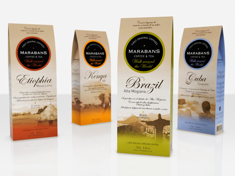
Marabans Orígenes - Coffee & Tea


Source: http://www.seriesnemo.es
La gama First Original Coffees de Marabans nos invita a recorrer el mundo: “Conoce lugares de ensueño a través de su sabor más auténtico”.
El sabor y aroma de estos exclusivos cafés nos evoca paises lejanos, exóticos y deseados, nos transporta, nos inspira y nos conduce a disfrutar de momentos inolvidables... WALK AROUND THE WORLD.

Aldi Frozen - Pack Design


Source: http://www.seriesnemo.es
Frozen line ALDI supermarkets. The present two special packs innovative frozen food sector: the window with product form and application of blue ink on transparency, creating the effect of water on the product

Thursday, February 16, 2012

Potato chips, Potato crafts


Source: http://www.seriesnemo.es

Assortment of snack: potato chips, potato crafts, ham flavor ... nachos, cocktail ... Different registers and finishes for different customers and users. Matt metallic inks and materials as new bets.

Fruto Seco Nuts Packaging Design


Design by: series nemo


NUTS. Aldi supermarkets.
A graphical family of products with two categories: premium and economy.

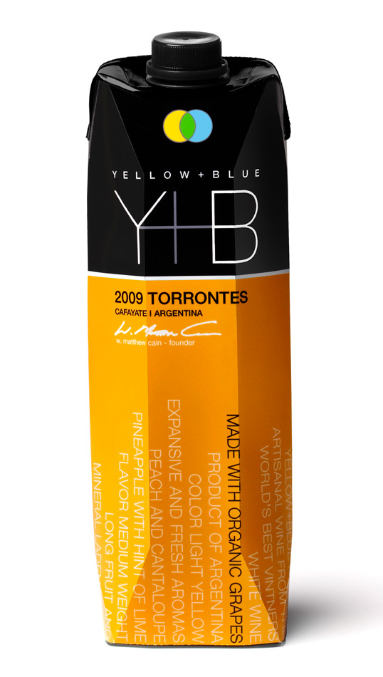
Yellow+Blue


Designed by Spear Design Group | Country: United States
Source: http://lovelypackage.com


“Yellow+Blue = Green, as in organic wines in recyclable Tetra Paks.
Spear Design Group developed the new packaging that tells the Yellow+Blue story for the company’s four eco-friendly, organic wines: Malbec, Torrontes, Sauvignon Blanc and Rosé.
Wine descriptors and factoids wrap around the eco-friendly carton: Artisanal wine from the world’s best vintners, made with organic grapes, 93% wine 7% packaging, smaller carbon footprint costs less to ship, contains 33% more wine than a 750ml glass bottle.
The type grows up vertically to create visual impact. Signed by the Founder & President of the company, W. Matthew Cain.”

Thursday, February 2, 2012

"Perfect Slice of Summer Watermelon" tissue boxes


Background information: Los Angeles-based Illustrator Hiroko Sanders created the illustrations for the new Kleenex “Perfect Slice of Summer” tissue box series. Since the illustrations are the primary part of each carton, the challenge was to create artwork utilizing a style that embodies the spirit of summer, and that works uniquely with the carton design.  The three boxes are images of different fruits rendered with a stylized realism that unifies the design of the package with the brand and product.


Project credits: Hiroko Sanders, Illustrator
Jennifer Brock, Senior Designer/Brand Design – Kimberly Clark Corp.

Source: http://www.thedieline.com/

Wednesday, February 1, 2012

Good Milk


Designed by StudioIN, Russia, Source: http://www.packagingoftheworld.com

Milk is a universal and indispensable product.
Going along with the modern tendency to popularize healthy lifestyles and recognizing the importance of environmental protection, we suggest that this product, serving all peoples well since times immemorial, should be super-popularly served in aluminum cans. Their advantages include light weight and strength, aesthetical appearance and compactness. Aluminum cans fully preserve the natural taste and quality of the product and are easily opened. Because of the new design of the packaging, milk may not be just served at home but also taken along anywhere.


Within the same concept, we also suggest a possible extension of the technology of the production of the Tetra Pak packaging. Our idea is using Congreve stamping in the production of regular milk cartons.

The design of the whole line is built on the contrast between the color of the logo with the predominant white, which, as we see it, goes just fine with the product. The soft pastel colors are either lighter or darker depending on fat content and may differ according to varying tastes. The appearance of the packaging will make this traditional product go well with the modern times and make a room for it among the popular beverages of the latest generations.

Because milk is so good for everyone and because of the radically new packaging, Goodmilk may now be called a super-drink.

Related Posts Plugin for WordPress, Blogger...